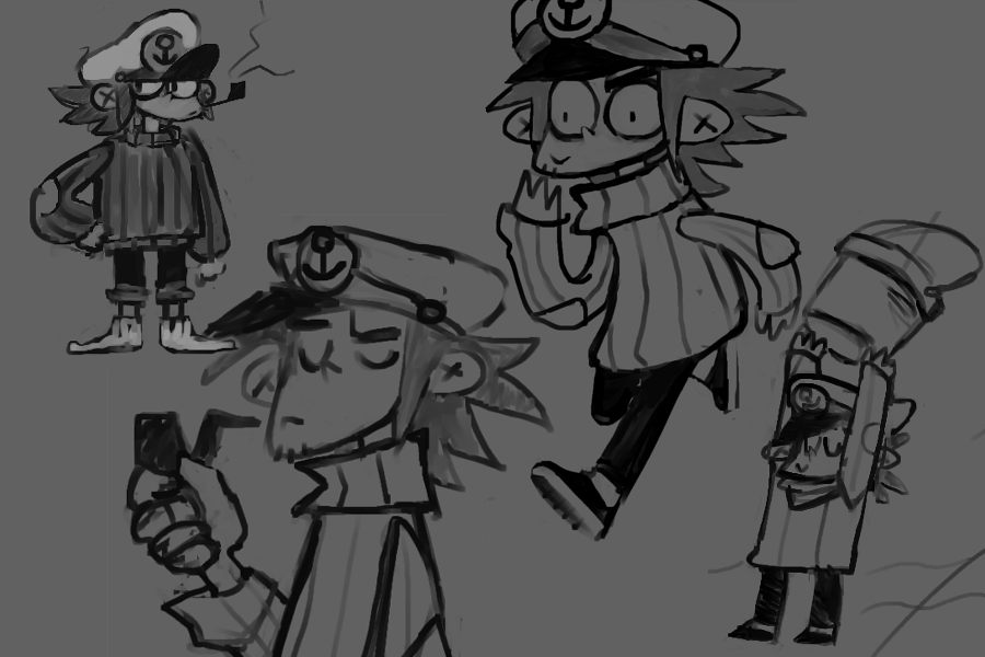
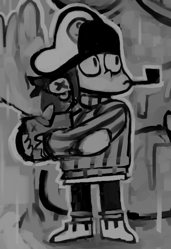
It's time to meet The Sailor! The character that you will be playing as in our decreasingly secretive next game.
While we'll still keep a lot of the narrative and background stuff under wraps at the moment (as the work is still in progress and subject to change), we'd like to showcase some of the visual aspects and early concept designs of our protagonist.
Early Concept Art
Looking at some of our first concepts for the sailor, it's clear our lead artist Casper nailed down certain key elements of the character very early on.

A couple iterations later, softening the edges, tweaking the proportions and losing the shoes, we ended up with the design we have today. It was important for us to convey the playfulness and tone of the game almost immediately with how the player character looked while still allowing for a range of expressiveness and personality when needed.

Drawing a concept and designing a character is one thing but of course we had to translate it to 3D, which is often a lot easier said than done! Luckily for us, Casper was also the one responsible for doing that, so really he only had himself to blame here.
2D Inspirations in 3D
We took a lot of inspiration from traditional 2D animation, namely playing with scaling and proportions of moving parts commonly referred to as squash and stretch. Not only did this help sell the motion of our character but it also once again reinforced our toony visuals. Casper had to rig and skin the character quite unconventionally to allow for this but that's a more technical post for another time!
If you scrub through these videos frame-by-frame you can see some very questionable single-frame poses as part of the character's animation. Definitely not realistic and somewhat nightmare inducing but when you play it back at normal speed it's all of a sudden playful and bouncy - magic!
We're also making use of both scaling and simple 2D sprites to animate The Sailor's mouth and eyes. This gives us a lot of control over the key elements of The Sailor's face, allowing us to be very expressive and convey a lot of personality to an otherwise simple character.
The Pipe
As an additional bonus, one morning Casper came to the rest of us and outlined specific pipe behaviour that he claims came to him in a dream. Here at Half Past Yellow we're all about achieving our pipe dreams so of course we had to implement it. The gist of it is that the pipe looks most interesting as a silhouette in profile view instead of head on in front of The Sailor's face or behind his head. As The Sailor moves around and rotates relative to the camera, the pipe tries its best to stay in profile as much as it can. It's very subtle and I'm sure it will be unnoticed by almost everyone, but now you know! It can be our shared little secret.
Moving On
Designing a solid character visual that reacts and also controls well is truly a gift that keeps on giving and we're very happy to have put the effort in quite early in our development. Not only is it immensely satisfying to move around the world, but it is also very appealing to watch as The Sailor fluidly and without hesitation spreads mischief and creates clutter wherever they roam. On the other hand, we have definitely lost some (significant?) productivity aimlessly jumping around so the jury is still out on whether this has been the right move for us production-wise.
In any case, we're very excited and can't wait for you to all to experience it for yourselves! Stay tuned for more previews and sneak peeks, and don't forget to follow us on our socials below if you haven't already!